
Quick-Start Guide
Getting Started with GovFeeds
Find real examples of how local governments communicate with residents — in seconds.
Find real examples of how local governments communicate with residents — in seconds.
GovFeeds is a search and analytics platform built by Public Square Analytics that indexes social media posts from more than 5,000 local government accounts across the United States. It lets you search by topic, filter by state, unit type (city, county, town, etc.), date range, and engagement level — then instantly see trends, top-performing posts, and real examples you can learn from or cite.
Think of it as a search engine purpose-built for government communications. Whether you want to see how cities handled a winter storm, how counties communicated about a disease outbreak, or how towns promoted a community event, GovFeeds surfaces those posts and wraps them in useful analytics.
See how peer agencies word emergency alerts, event promotions, and public-health messages — then adapt the best ideas for your own community.
Quickly find which local governments are talking about a breaking issue, track how messaging evolves over time, and locate high-engagement posts worth covering.
Build datasets of government social media activity around specific topics, analyze communication patterns, and download CSVs for further analysis.
Monitor how governments are (or aren't) communicating about issues you care about, and identify models of strong public outreach to share with partners.
GovFeeds lives at app.govfeeds.com. When you visit for the first time, you'll see the sign-in page with options to log in, create an account, or start a free trial.
If you're new to GovFeeds, you have two options at the bottom of the sign-in page. You can click "Sign-up (14-day free trial)" to get started immediately — no payment information is required! If you'd like ongoing access, click "Become a subscriber!" to set up a paid subscription. Either way, you'll be up and running in under a minute.
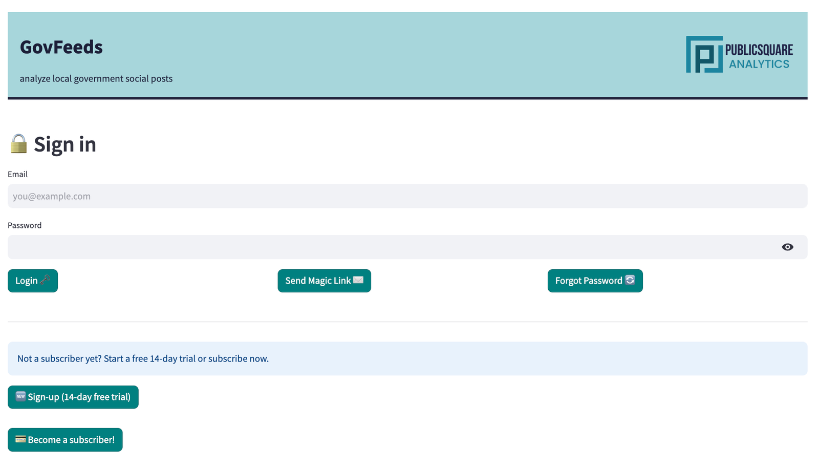
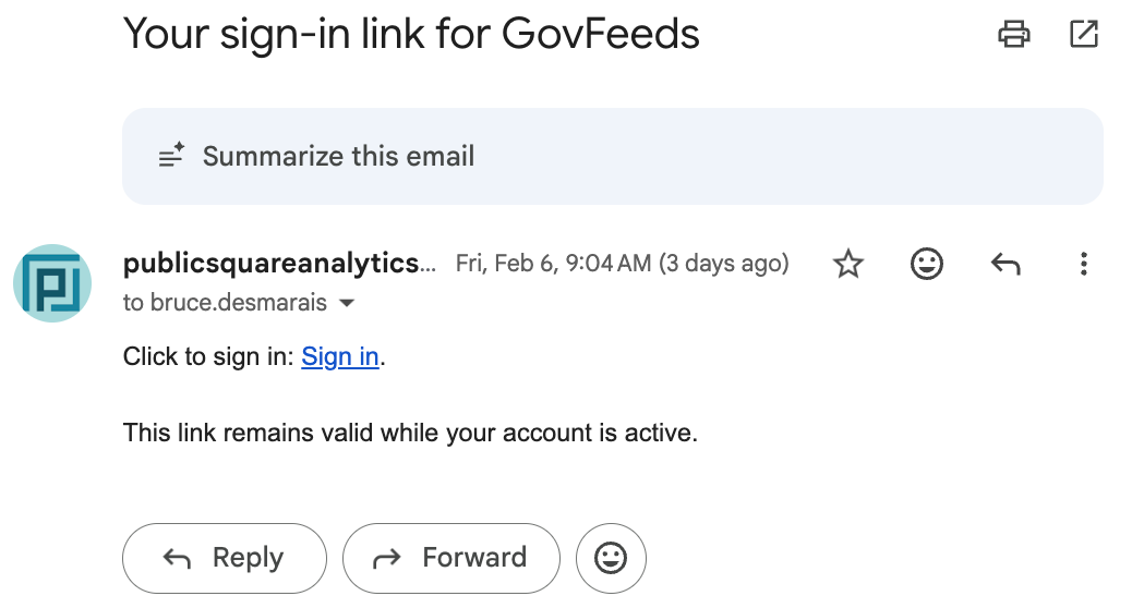
Once you have an account, there are two ways to sign in:
After logging in, you'll land on the GovFeeds dashboard. The top of the page confirms you're authenticated and shows a summary of platform activity over the last seven days — total posts added, the weekly average, the number of active government units, and the week-over-week change. Below that, you'll see spotlights on especially productive or engaging accounts.
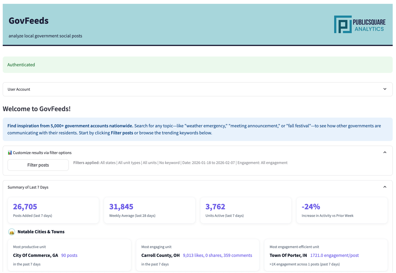
The key action here is the Filter posts button. Clicking it opens a modal where you define exactly what you're looking for. Let's walk through two real examples.
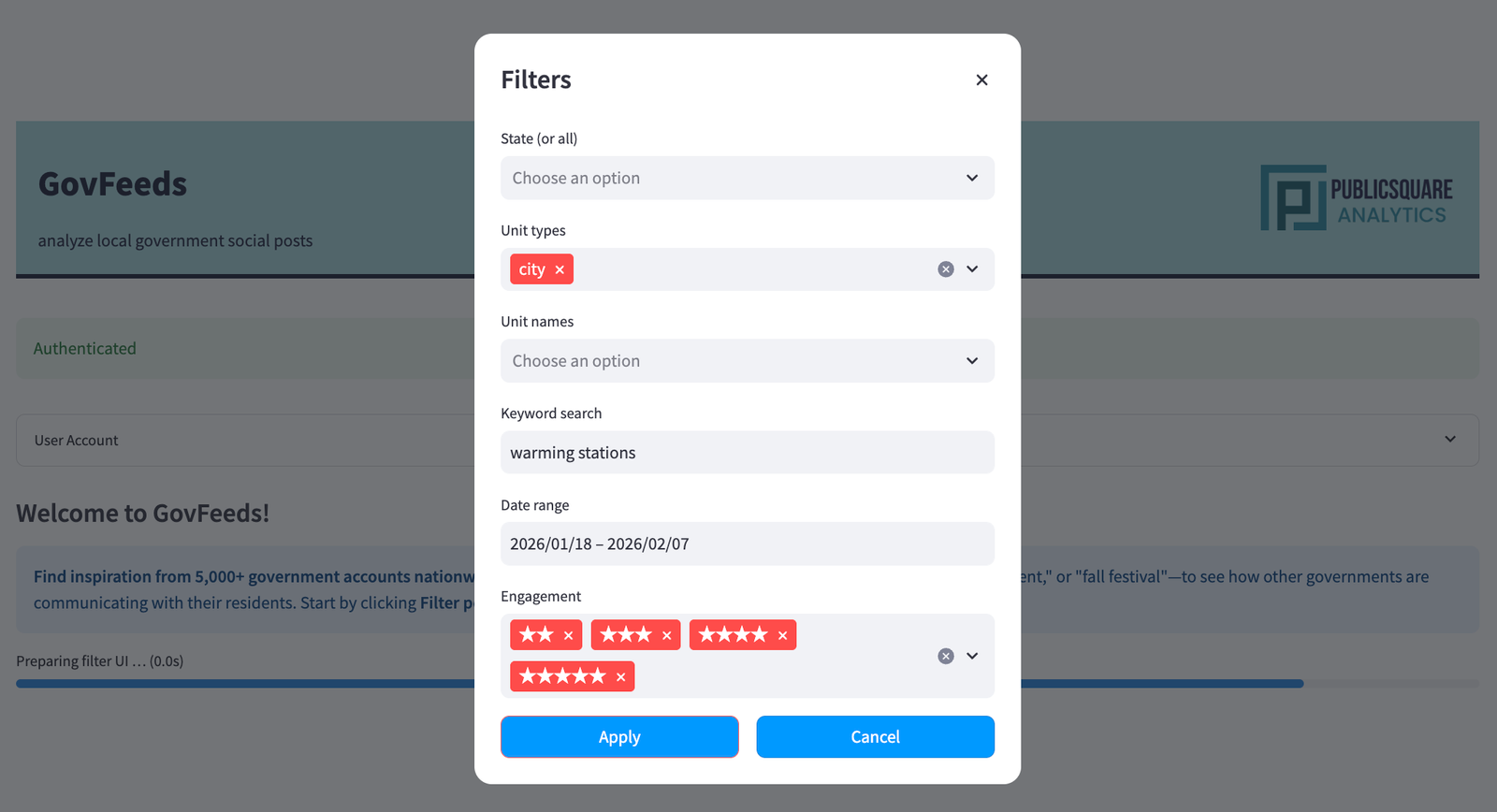
In late January 2026, a major winter storm swept across much of the southern and central United States. Cities scrambled to open warming centers, coordinate shelters, and keep residents informed. Let's use GovFeeds to find out how they communicated about it.
Click Filter posts on the homepage. In the modal that appears, enter your search parameters. For this example we'll use:
warming stationsThen click Apply.
After applying filters, GovFeeds returns a results page with four analytics panels at the top. For the warming-stations search, the platform found 297 matching posts. Here's what each panel tells you:
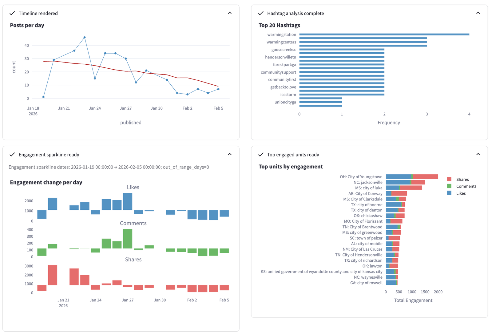
Posts per day (top-left) shows a clear spike around January 21–24, aligning with the storm's arrival. The red trend line reveals the volume tapering off as conditions improved. Top hashtags (top-right) confirms the expected vocabulary — #warmingstation, #warmingcenters, and location-specific tags. The engagement sparkline (bottom-left) breaks likes, comments, and shares over time, showing that shares peaked on January 21 — people were actively amplifying shelter information as the storm hit. Finally, top units by engagement (bottom-right) reveals which cities generated the most community interaction; Youngstown, OH and Jacksonville, NC led the pack.
Scroll down to find a ranked list of the most active posting units, a word cloud of keywords across all matching posts, and a paginated table of individual posts. The word cloud gives an at-a-glance sense of the dominant language governments used: "warming," "shelter," "center," "weather," "open," "cold," "road," "emergency."
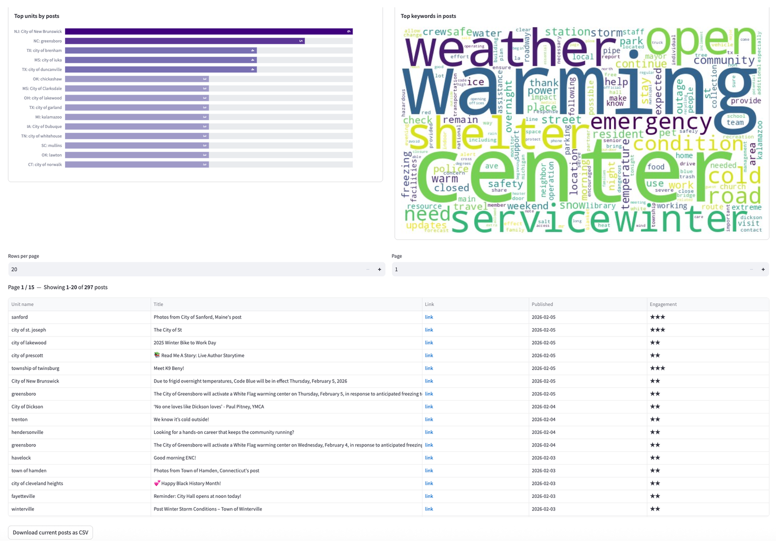
Each row in the table links directly to the original social media post, so you can see the full text, images, and community responses. You can also download the current results as a CSV using the button at the bottom of the table — useful for building a research dataset or an internal report.
Clicking through to individual posts reveals how different cities tailored their messaging. Here are two examples that illustrate the range of approaches:
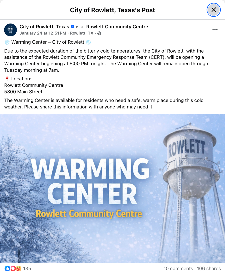
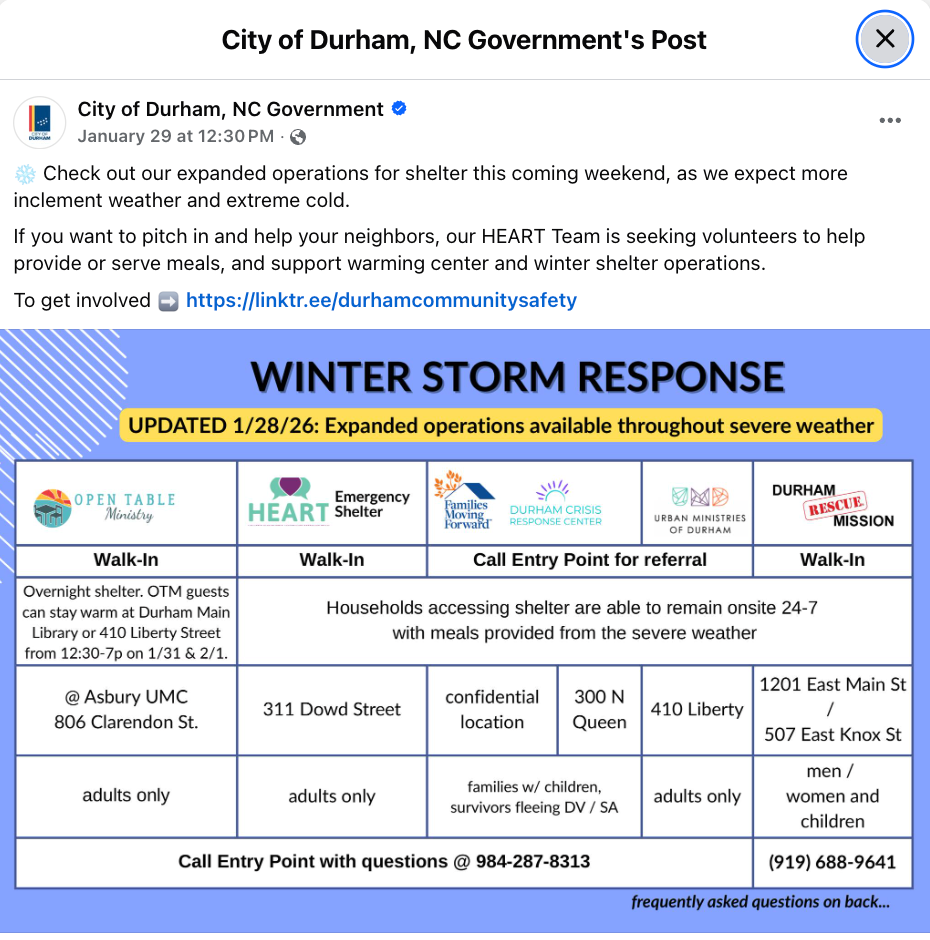
Rowlett's post is a strong example of a simple, shareable graphic — one location, one clear call to action. Durham's post takes a more comprehensive approach, aggregating multiple organizations into a single reference sheet. Both earned significant engagement, suggesting that the right format depends on local context and the number of resources available.
In early 2026, measles cases surged in parts of the U.S., particularly in the Upper Midwest and North Carolina. Local health departments and counties turned to social media to warn residents about exposures, encourage vaccination, and share guidance. Let's see what GovFeeds surfaces for this topic.
Searching for the keyword measles across the same three-week window returns 87 matching posts. The timeline shows a different pattern than the warming-stations search: instead of a sharp spike, measles posts built gradually, rising from about 3 posts per day in mid-January to a steady 7–9 per day in early February as the outbreak expanded.
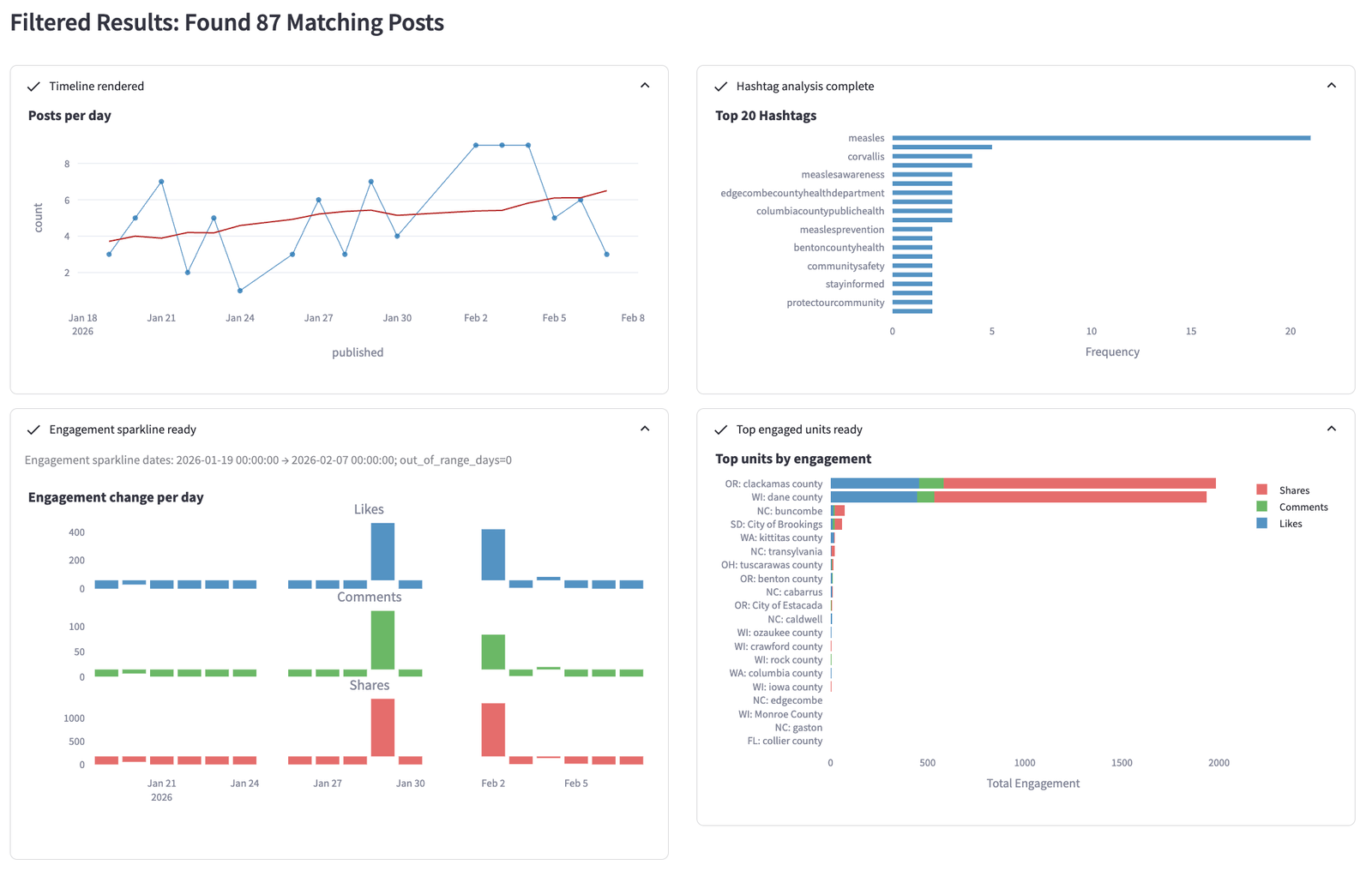
The engagement panel is particularly revealing. Shares vastly outweigh likes and comments — exactly what you'd expect for urgent public-health alerts that people want their networks to see. The top hashtags confirm a health-focused vocabulary: #measles, #measlesawareness, #measlesprevention, along with location-specific tags from active county health departments.
The post table and word cloud paint a vivid picture of the outbreak response. The word cloud is dominated by terms like "vaccine," "exposure," "health," "case," "confirmed," "quarantine," "symptoms," and "vaccination" — the core vocabulary of public-health crisis communications.
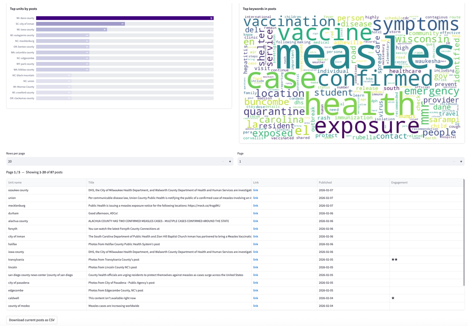
The post table surfaces exposure notices from counties as varied as Ozaukee (WI), Union (NC), Mecklenburg (NC), Alachua (FL), and San Diego (CA). Each "link" cell takes you to the original post, making it easy to compare messaging strategies across jurisdictions.
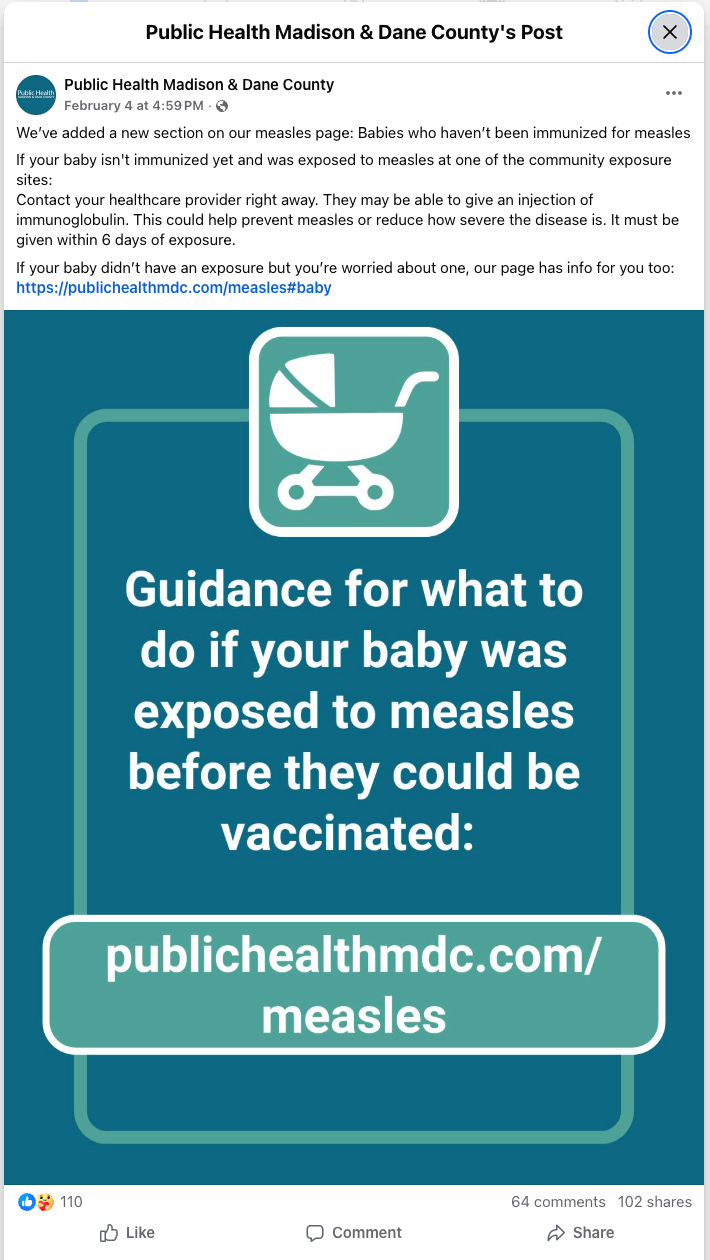
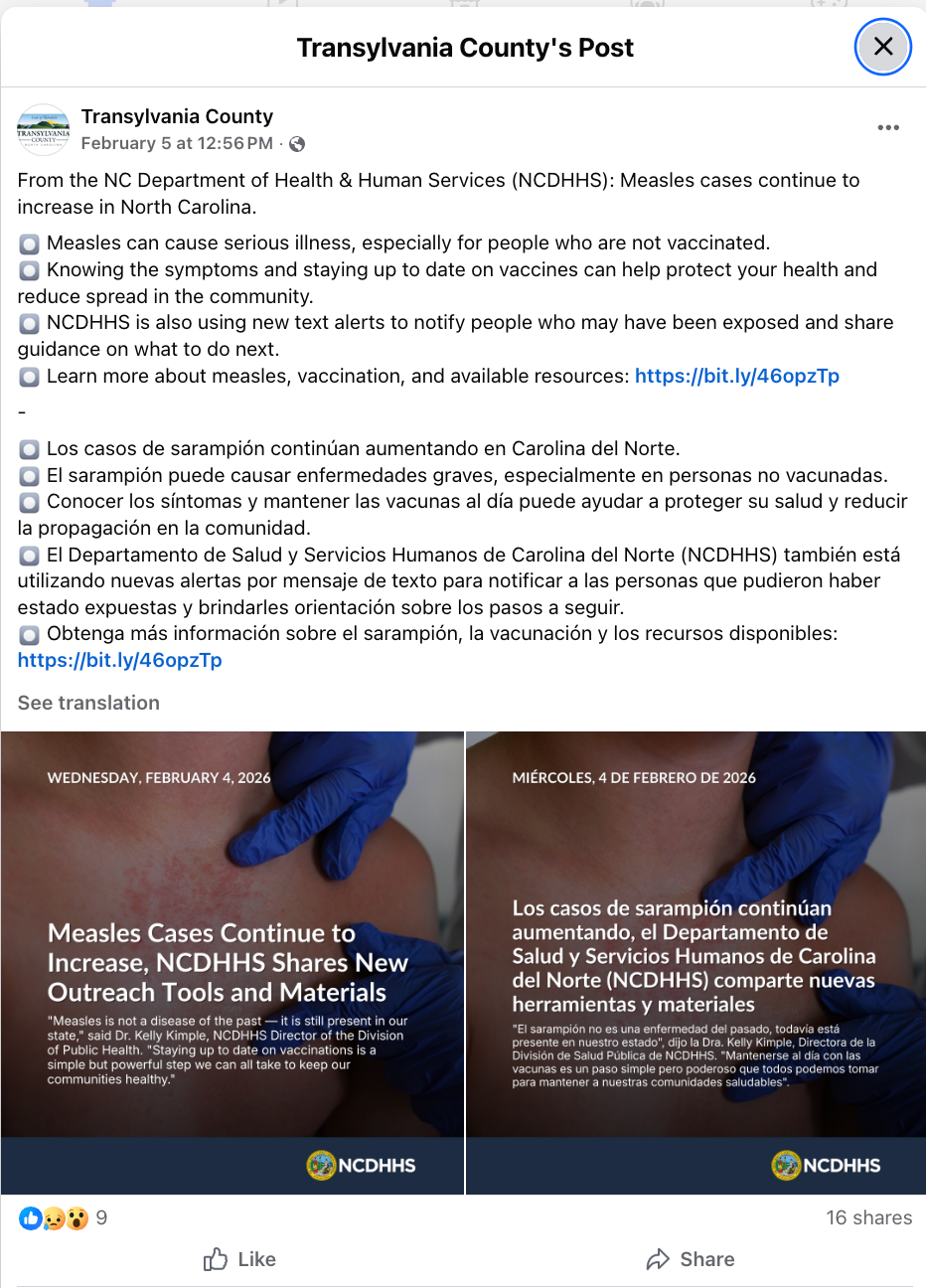
These two posts illustrate different but effective approaches. Dane County zeroed in on a specific vulnerable population — babies too young to be vaccinated — with a clear call to action (contact your provider, immunoglobulin may be available within 6 days). Transylvania County amplified a state-level message in both English and Spanish, reflecting the bilingual needs of their community. The Dane County post generated far more engagement, likely because it targeted an audience with an immediate, actionable need.
Begin with a single keyword and a wide date range. Scan the word cloud and hashtags to discover the vocabulary governments actually use — it may differ from what you'd expect. Then refine with additional filters. For instance, you might start with "shelter" and discover that "warming center" or "Code Blue" are the more common terms in your region of interest.
If you're a communicator looking for best-practice examples, filter for high-engagement posts (4–5 stars). If you're a researcher building a comprehensive dataset, keep the engagement filter open to capture the full range of activity. Journalists may want to focus on the middle — posts with moderate engagement that represent typical, not just exceptional, government communication.
Cities, counties, and towns communicate differently. Running the same keyword search across different unit types can reveal interesting contrasts — counties tend to share more detailed public-health information, while cities often produce more branded, shareable graphics.
Every search result page offers a Download current posts as CSV button at the bottom of the post table. This is the fastest way to move from GovFeeds into your own analysis workflow — whether that's Excel, R, Python, or a qualitative coding tool.
boil water advisory, road closures, community event, budget hearing, tornado warning. Each will surface a different slice of how governments talk to the public.